With the introduction of SharePoint 2013, we saw many things change.
Some of the major new features relate to branding. In previous posts, I
have explored in detail how to convert a regular HTML into a SharePoint Master Page using the new Design Manager. I also covered some of the cool things we can do with the Design Manager like setting up Device Channels, etc. In this article, I want to focus on the new “Composed Look”
available in SharePoint 2013. Now, I am not going to show you how to
pick one that is already available, I am sure you can figure that one
out. No, in this article we will create our own and make it available
for deployment, step by step.
 And some of the changes a power user can make using the interface:
In this example, I will simply copy one of the existing Master Pages and name it differently. However, I need to know what to copy.
In SharePoint 2013, Master Pages are made of an HTML file, which is where we make our main customizations, a Master file that SharePoint reads and a Preview file. Do Not modify the .master file this file is handled by SharePoint.
The .Preview file should have the same name as the HTML and Master file, it is used to make Master Pages you create available in the drop down menu of “Site Layout” when modifying a composed look.
**You don’t need the .preview file to create a Composed Look but you will need it if you want to complete your Composed Look and make your Master Page available in “Site Layout” **
 I copied and renamed the Oslo Master Page using SharePoint Designer.
You can use SharePoint Designer 2010 or 2013 with SharePoint 2013; they
both work for what we need to do.
I copied and renamed the Oslo Master Page using SharePoint Designer.
You can use SharePoint Designer 2010 or 2013 with SharePoint 2013; they
both work for what we need to do.
 You don’t need to rename the oslo.master file, it is linked to the html file and should rename itself.
 Of course in this example my Master Page is still using the default
SharePoint CSS files. In your case, it will be using a custom CSS file
don’t forget to link it as you would usually do in your html file. It
doesn’t impact the rest.
Of course in this example my Master Page is still using the default
SharePoint CSS files. In your case, it will be using a custom CSS file
don’t forget to link it as you would usually do in your html file. It
doesn’t impact the rest.
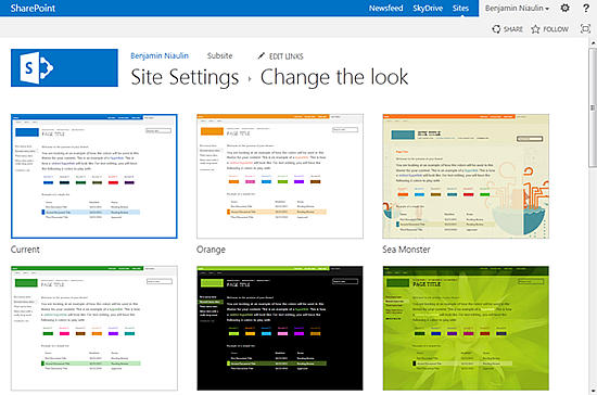
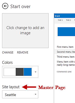
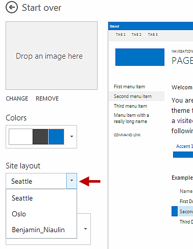
Let’s make sure my files are working for now by going to Site Settings and clicking on “Change the Look”. Select any look to modify and you should now see your Master Page appearing in the “Site Layout” drop down menu.
 Of course right now it looks and acts exactly the same way as Oslo. I’ll explain the Preview file later on in this article.
If you have experience with SharePoint 2010 themes, you’re going to find this very familiar.
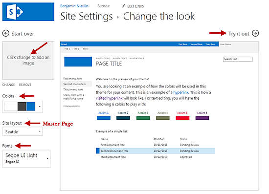
Earlier we mentioned that a Composed Look is made up of a few things, which include Color Palettes and Font Palettes. How do I know this and where do you find them?
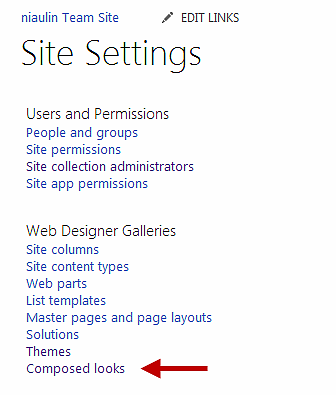
Navigate to Site Settings and locate the Web Designer Galleries section to click on Composed Looks.
 In here you will see the configuration for each available Composed
Look in the site. One of our final goals will be to have our own listed
here. For now, we just want to see how they are configured.
In here you will see the configuration for each available Composed
Look in the site. One of our final goals will be to have our own listed
here. For now, we just want to see how they are configured.
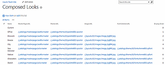 As you can see, a Composed Look needs to know what its Master Page,
Theme (which I call a Color Palette), background image and font scheme
(which I call a Font Palette) is.
As you can see, a Composed Look needs to know what its Master Page,
Theme (which I call a Color Palette), background image and font scheme
(which I call a Font Palette) is.
So my next step will be to see what this .spcolor file is made of.
Here is what you can in SharePoint Designer once you navigated there:
 Copy and paste one of the Palette spcolor files and rename it. The files will be displayed alphabetically in SharePoint.
I copied the Palette010 and renamed it in this example.
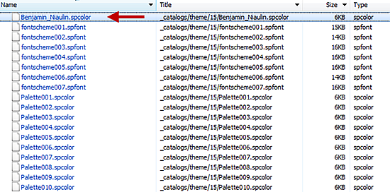 Because my file name starts with a B and all others with a P, my
color file will be displayed first in the Color menu of my Composed
Look.
Because my file name starts with a B and all others with a P, my
color file will be displayed first in the Color menu of my Composed
Look.
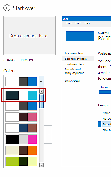 If you scroll down you will see that there is another Color Palette
with the exact same configuration as the first one. That’s because I
copied the Color Palette 010 and made it my own to customize.
If you scroll down you will see that there is another Color Palette
with the exact same configuration as the first one. That’s because I
copied the Color Palette 010 and made it my own to customize.
Editing the spcolor file can be done using SharePoint Designer 2010, 2013 or even notepad if you want.
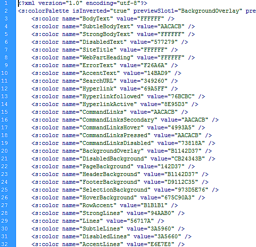 The file is very straight forward and you can create as many Color
files as you want. This file simply associates a “name” with a color
value.
The file is very straight forward and you can create as many Color
files as you want. This file simply associates a “name” with a color
value.
The cool thing is that SharePoint 2013 supports RGBA, this means you can apply transparency as well!
I won’t explain how to write the color value as someone already wrote a very detailed article on just that.
Let’s change the color value of SiteTitle and WebPartHeading for the fun of it and see what happens.
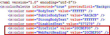 I decided to go with a light sort of green so we can see the
difference. Save the file and navigate back to your site settings to
choose your custom color palette.
I decided to go with a light sort of green so we can see the
difference. Save the file and navigate back to your site settings to
choose your custom color palette.
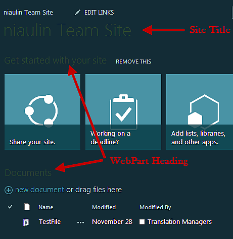 If I look back at the original color palette that I copied from, we should see a small difference.
Original:
 As you can see, just by changing the Color palette from the “Change
the Look” screen of the Composed Looks I was able to give a different
design to my SharePoint site.
As you can see, just by changing the Color palette from the “Change
the Look” screen of the Composed Looks I was able to give a different
design to my SharePoint site.
Summary of the spcolor file:
An SPCOLOR file is a file that associates reusable names to a color value. Look at them like variables.
Wait, how?
Why were my changes applied instantly after I saved my spcolor file? I never referenced those “names” in the spcolor file to anything.
If you recall, I simply copied one of the out of the box Master Pages offered by SharePoint. That includes the link to the out of the box CSS file used and referenced by the Master Page. That CSS file already has the names in the spcolor file used within it.
Here is an example of what the SharePoint CSS looks like:
Notice that the color already has a value of #262626. However, it is preceded by what looks like a CSS comment with one of those “names” used in the .spcolor file.
You guessed it, when writing your CSS you can actually reference any of those names used in our spcolorfile anywhere. Once the Color Palette is applied through the Change the Look menu in site settings, it will overwrite whatever color you had specified in your CSS to the one in the spcolor file under the associated name.
Your responsibility:
It will require extra work when building the CSS to make sure you think about the possible changes you might want to apply.
Powerful in the enterprise:
Imaging the possibilities, the Composed Look can offer your company. Having a design created that can be tweaked by department or division or even by region. Applying slightly different colors but only at the places defined in the CSS.
Let’s open the spfont file and see how it works. The spfont file was located in the same folder as our spcolor file /_catalogs/theme/15/.
 The spfont file has already been explained here in detail so I won’t copy everything here.
The file is very straightforward if you understood the spcolor file, essentially it is the same concept.
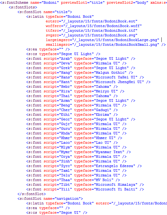 In short, the file is made of fontSlots, which is very similar to the
“name” in spcolor. For each of these fontSlot you can specify the font
you would like to use based on the language of the user. You can erase
all of the <s:font> lines that you do not plan on using but you
cannot remove <s:ea> and <s:cs> as they are required by
Composed Looks to work.
In short, the file is made of fontSlots, which is very similar to the
“name” in spcolor. For each of these fontSlot you can specify the font
you would like to use based on the language of the user. You can erase
all of the <s:font> lines that you do not plan on using but you
cannot remove <s:ea> and <s:cs> as they are required by
Composed Looks to work.
Then, you simply use the fontSlot in your CSS as we saw earlier.
/* [ReplaceFont(themeFont:"title")] */ font-family:”Segoe UI Light”,”Segoe UI”,”Segoe”,Tahoma,Helvetica,Arial,sans-serif;
In this scenario, my CSS specified the Segoe font family but it will be replaced with whatever is associated to “title” in my spfont file referenced by the active Composed Look.
The preview file is used to make the Master Page available in the “Site layout” drop down when creating a Composed Look.
The preview file is split into the definition of CSS classes including the Color Palette and Font Palette that we want to use as well as some html to preview your design in the Composed Look window.
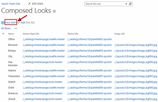 Click on New Item:
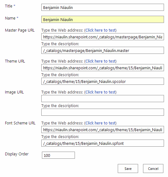 Enter all the necessary information to create a Composed Look.
The Image URL is for the background image that will be applied to the <body> html tag directly.
The next time you navigate to the “Change the Look” setting under you Site Actions or Site Settings you will have a new Composed Look available that will include your Master Page, CSS, Colors, Fonts and background image if it applies.
 There is a good MSDN article that covers this topic here:
msdn.microsoft.com/en-us/library/jj862342.aspx
This will create a WSP file for you to download and deploy in other Site Collections. The package includes all the custom files that we have created as long as you followed the instructions or warnings on the MSDN link above.
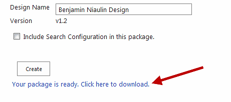 Download your file to your desktop or on a shared drive available to the team.
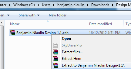
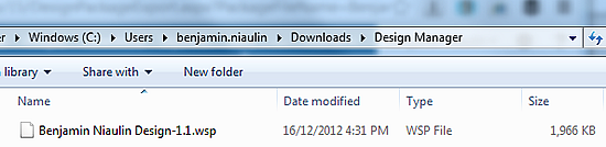 You can always check the content of the file by renaming it to a .cab file and exploring.
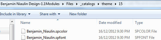
 Navigate inside the Modules folder under files you will see that all your files have been packaged and ready to use as a WSP.
 I hope that this opens your eyes to the possibilities that the
Composed Looks can offer to your business. I know it definitely helped
me understand the value a lot better when I started playing with my own
Master Pages.
I hope that this opens your eyes to the possibilities that the
Composed Looks can offer to your business. I know it definitely helped
me understand the value a lot better when I started playing with my own
Master Pages.
**UPDATE** Don’t forget to expect the Theme Slots tool to come out shortly for SharePoint
Discovery on how to use Composed Looks in your company
Perhaps it’s just me, but I just realized how powerful these Composed Looks are in the enterprise. The idea of templating your Branding, yet providing the flexibility to the user to make minor changes. I started thinking and saw the possibilities.What is a Composed Look?
First, we need to make sure we understand what it is before we can start. So what is a Composed Look? A possible definition of the word “Composed” could be: “To make or create by putting together parts or elements”. I believe this fits with our use of this feature. A Composed Look is made up of:- Master Pages
- CSS
- Color palettes
- Font palettes
- Background image
What does this mean for you?
This means we can package a Master Page with its CSS, color palettes, font palettes and background image and have it deployed in the enterprise. With Composed Looks, you can now offer your Power Users a list of branded looks and allow them to choose an appropriate look as well as giving them limited control to make changes to the colors, image or font. You could be providing them Composed Looks.Let’s create a Composed Look
Start with the SharePoint Master Page
I won’t explain how to create a Master Page in this article as I already covered it here. But the first step in creating a Composed Look is by creating a Master Page. The Master Page is the HTML structure that holds the design together with SharePoint controls to make sure everything works.In this example, I will simply copy one of the existing Master Pages and name it differently. However, I need to know what to copy.
In SharePoint 2013, Master Pages are made of an HTML file, which is where we make our main customizations, a Master file that SharePoint reads and a Preview file. Do Not modify the .master file this file is handled by SharePoint.
The .Preview file should have the same name as the HTML and Master file, it is used to make Master Pages you create available in the drop down menu of “Site Layout” when modifying a composed look.
**You don’t need the .preview file to create a Composed Look but you will need it if you want to complete your Composed Look and make your Master Page available in “Site Layout” **
Let’s make sure my files are working for now by going to Site Settings and clicking on “Change the Look”. Select any look to modify and you should now see your Master Page appearing in the “Site Layout” drop down menu.
The CSS and how to make it work with Composed Looks
Copying the Master Page was the easy part, now we have to make sure that the CSS, the designer or you wrote, is compatible with Composed Looks. What do I mean by compatible? The whole point of a composed look is to give the ability to Power Users to make customizations like colors and font.If you have experience with SharePoint 2010 themes, you’re going to find this very familiar.
Earlier we mentioned that a Composed Look is made up of a few things, which include Color Palettes and Font Palettes. How do I know this and where do you find them?
Navigate to Site Settings and locate the Web Designer Galleries section to click on Composed Looks.
So my next step will be to see what this .spcolor file is made of.
Understanding the .spcolor file
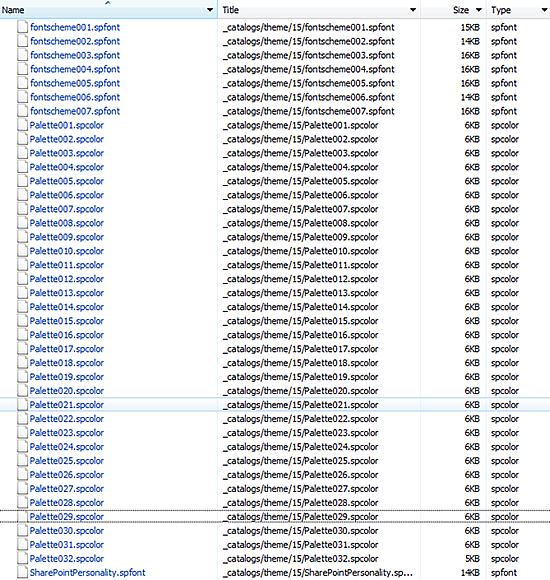
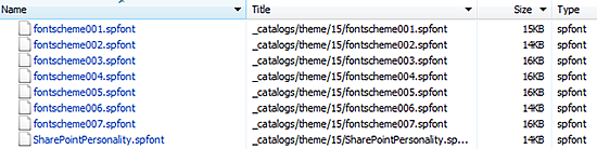
Using SharePoint Designer, navigate to /_catalogs/theme/15/ and there you will find all the .spcolor files we are looking for. Of course they are also located directly on the file server where SharePoint is installed but I don’t recommend modifying those files.Here is what you can in SharePoint Designer once you navigated there:
I copied the Palette010 and renamed it in this example.
Editing the spcolor file can be done using SharePoint Designer 2010, 2013 or even notepad if you want.
The cool thing is that SharePoint 2013 supports RGBA, this means you can apply transparency as well!
I won’t explain how to write the color value as someone already wrote a very detailed article on just that.
Let’s change the color value of SiteTitle and WebPartHeading for the fun of it and see what happens.
Original:
Summary of the spcolor file:
An SPCOLOR file is a file that associates reusable names to a color value. Look at them like variables.
Using the names provided in the spcolor file in your CSS
Very similar to SharePoint 2010 themes, you can now apply these names provided by the linked spcolor file directly in your CSS.Wait, how?
Why were my changes applied instantly after I saved my spcolor file? I never referenced those “names” in the spcolor file to anything.
If you recall, I simply copied one of the out of the box Master Pages offered by SharePoint. That includes the link to the out of the box CSS file used and referenced by the Master Page. That CSS file already has the names in the spcolor file used within it.
Here is an example of what the SharePoint CSS looks like:
/* [ReplaceFont(themeFont:"title")] */ font-family:"Segoe UI Light","Segoe UI","Segoe",Tahoma,Helvetica,Arial,sans-serif;
/* [ReplaceColor(themeColor:"SiteTitle")] */ color:#262626;
}
<
Notice that the color already has a value of #262626. However, it is preceded by what looks like a CSS comment with one of those “names” used in the .spcolor file.
You guessed it, when writing your CSS you can actually reference any of those names used in our spcolorfile anywhere. Once the Color Palette is applied through the Change the Look menu in site settings, it will overwrite whatever color you had specified in your CSS to the one in the spcolor file under the associated name.
Your responsibility:
It will require extra work when building the CSS to make sure you think about the possible changes you might want to apply.
Powerful in the enterprise:
Imaging the possibilities, the Composed Look can offer your company. Having a design created that can be tweaked by department or division or even by region. Applying slightly different colors but only at the places defined in the CSS.
The spfont file works the same way
As you may have noticed in my piece of CSS above, we can do the same thing to font as we did with colors. By that I mean, specifying our desired font in the CSS and allowing users to switch “Font” from the Choose the Look menu. Just like our colors, the Font palette will go through our CSS to find which classes have a “ReplaceFont” attribute and replace it with what we specify.Let’s open the spfont file and see how it works. The spfont file was located in the same folder as our spcolor file /_catalogs/theme/15/.
The file is very straightforward if you understood the spcolor file, essentially it is the same concept.
Then, you simply use the fontSlot in your CSS as we saw earlier.
/* [ReplaceFont(themeFont:"title")] */ font-family:”Segoe UI Light”,”Segoe UI”,”Segoe”,Tahoma,Helvetica,Arial,sans-serif;
In this scenario, my CSS specified the Segoe font family but it will be replaced with whatever is associated to “title” in my spfont file referenced by the active Composed Look.
The Preview file for the Master Page
If you recall, I copied a Master Page at the beginning of this article. Even if I had created my own Master Page, I would still need to copy a Preview file and rename it exactly like my Master Page to associate them together.The preview file is used to make the Master Page available in the “Site layout” drop down when creating a Composed Look.
The preview file is split into the definition of CSS classes including the Color Palette and Font Palette that we want to use as well as some html to preview your design in the Composed Look window.
Creating the new Composed Look
All that is left for us to do is to put the files together into a Composed Look. We’re going to go back to the Site Settings under the Web Designer Galleries to modify or create a new Composed Look.The Image URL is for the background image that will be applied to the <body> html tag directly.
The next time you navigate to the “Change the Look” setting under you Site Actions or Site Settings you will have a new Composed Look available that will include your Master Page, CSS, Colors, Fonts and background image if it applies.
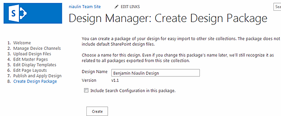
Deploy your Composed Look as a solution
SharePoint 2013′s Design Manager also offers a feature to Create a Design Package. This can be found under the Design Manager options in Site Settings.msdn.microsoft.com/en-us/library/jj862342.aspx
This will create a WSP file for you to download and deploy in other Site Collections. The package includes all the custom files that we have created as long as you followed the instructions or warnings on the MSDN link above.
**UPDATE** Don’t forget to expect the Theme Slots tool to come out shortly for SharePoint

0 comments:
Post a Comment